Layout Builder & Paragraphs: How They Work Together
Layout Builder is the powerful visual design tool that allows you to customize the main content area of any page on a site-by-site basis. It lets you create custom rows, columns, and sections that are completely independent of the site's overall Theme and Regions.
If Layout Builder defines the structure of your page (the rows and columns), Paragraphs are the flexible content components that you put inside those rows and columns. Think of them as pre-built, reusable widgets for content, like a mini-block system for content editors. Together, they give you complete, no-code control over both the structure and the content of your landing pages.
Layout Builder:
-
What It Is: Layout Builder is a visual drag-and-drop editor for designing unique page layouts without touching code. It replaces the simple "Body" field on a Content Type with a dynamic layout canvas.
-
What It Does (Its Function):
-
Creates Structure: It allows you to divide the content space into sections with different column arrangements (e.g., a two-column row followed by a three-column row).
-
Places Content: It is the primary tool used to place Blocks and Paragraphs (your content components) directly into the page sections you create.
-
Per-Page Customization: You can define a default layout for all Articles, but then override that default to create a completely unique layout for one specific, important Article.
-
-
Why It Is Beneficial (For You):
-
Total Design Control: It gives you unparalleled flexibility to design visually rich and complex landing pages that were previously only possible with custom coding.
-
Visual Editing: You can add, move, and configure sections and components directly on the front-end of the page, seeing the results instantly—there's no need to switch between the admin and the public view.
-
Simplifies Content Updates: Once the layout is set, content creators simply edit the content components within the structure, without worrying about breaking the page's design.
-
Official Drupal Documentation Links
-
Layout Builder Overview (Drupal.org):
-
Building Layouts Using the Layout Builder UI:
If Layout Builder defines the structure of your page (the rows and columns), Paragraphs are the flexible content components that you put inside those rows and columns. Think of them as pre-built, reusable widgets for content, like a mini-block system for content editors.
Here is a simple breakdown of Paragraphs:
-
What They Are: A Paragraph is a small, modular, and reusable piece of content structure. Instead of a single, long "Body" field, your page is built by stacking various Paragraph types. Examples of Paragraph types include:
-
Text/Image Component: A structured area to input text and an accompanying image.
-
Call-to-Action (CTA): A dedicated box with a headline, brief text, and a button link.
-
Accordion/Tabbed Content: A component designed to hold content that expands or toggles.
-
-
What They Do (Their Function):
-
Modular Content: They allow editors to build a page by selecting and stacking different components, rather than formatting one large text box.
-
Enforce Design: Each Paragraph type has a defined design and set of Fields. This guarantees that every CTA you add to the site will look consistent and professional without the editor needing to worry about styling.
-
Sit in Layout Builder: They are placed into the specific sections, columns, and rows created by Layout Builder.
-
-
Why They Are Beneficial (For You):
-
Easy Page Building: Page creation becomes simple and intuitive: click "Add Paragraph," choose the component you need, fill in the fields, and save.
-
Consistency Guaranteed: Since the styling is handled by the Paragraph template itself, content editors can focus entirely on the message, knowing they can't accidentally break the design or stray from the brand's look.
-
Content Reusability: If you need a simple image gallery, you build it once as a Paragraph type, and then you can reuse that exact component on any page using Layout Builder.
-
Official Drupal Documentation Links (Contributed Module)
-
Paragraphs Module Project Page: Since Paragraphs is a widely-used contributed module, this is the official project home.
This entry, combined with Layout Builder, gives your site builders the full picture of how to manage content on your custom pages!
Website General FAQs
These frequently asked questions cover common inquiries about the organization, our documentation, and how to find information on the website. This information is intended for all site visitors.
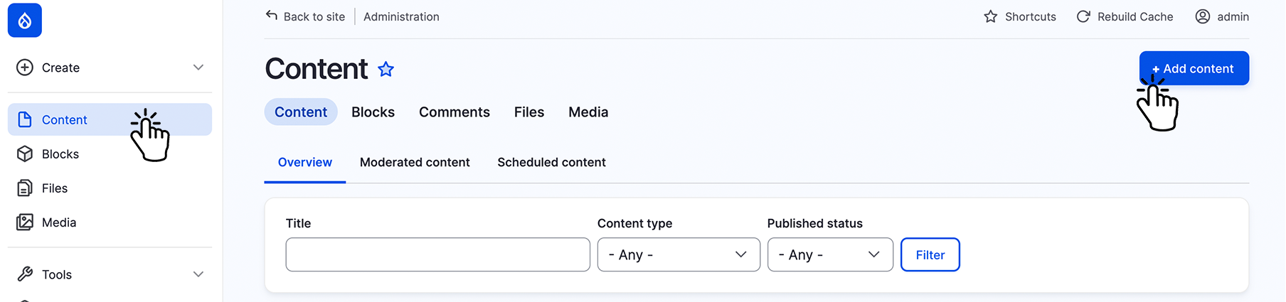
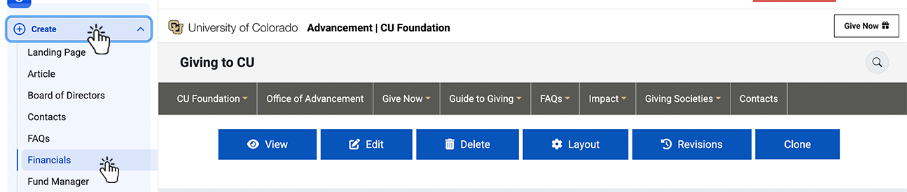
Step 1:
Select "Content" on the left top menu.
Step 2:
Select "+Add Content" on the top right.
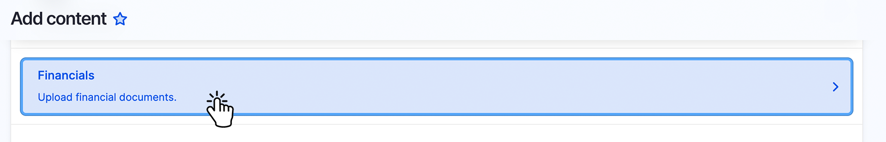
Step 3:
Select "Financials Upload financials documents".
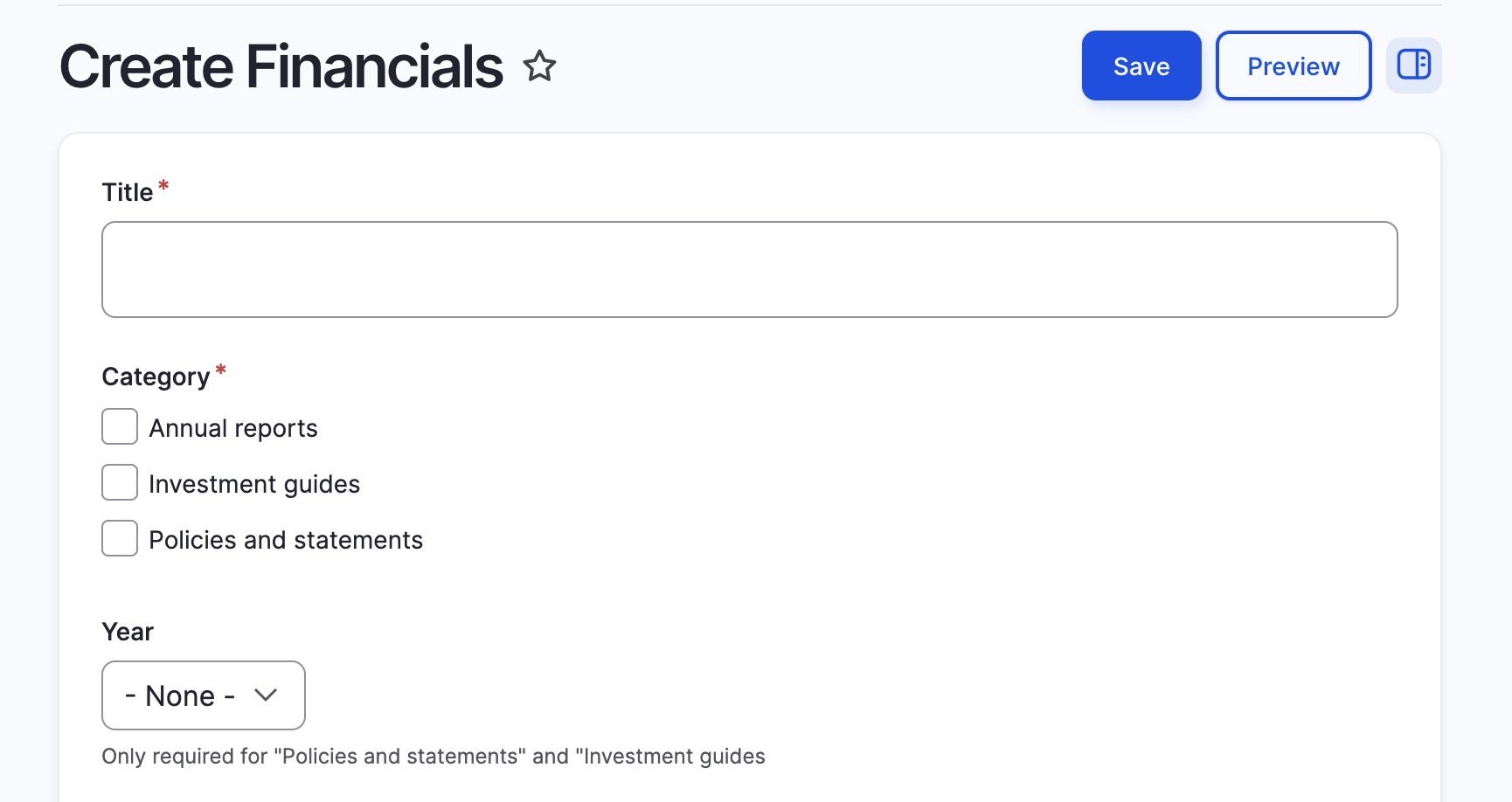
Step 4:
Fill out the form with the required fields and options. You can also choose to protect the file so that it is only accessible to logged‑in users, or leave it available to everyone.
Step 1:
Select "Create" on the left top menu.
Step 2:
Select "Contacts" from the dropdown menu.
Step 3:
Complete the form and select the "Category" for the contact to appear.
Note: Last Name is needed for sorting.
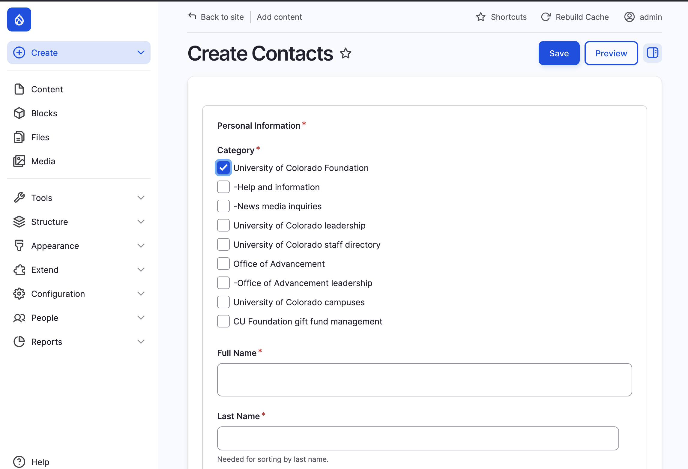
Step 1:
Select "Create" on the left top menu.
Step 2:
Select "Contacts" from the dropdown menu.
Step 3:
Fill out form and select the appropriate category.
Step 4:
Upload the document using the desired access (protected is for those with "Fund Manager" permissions).
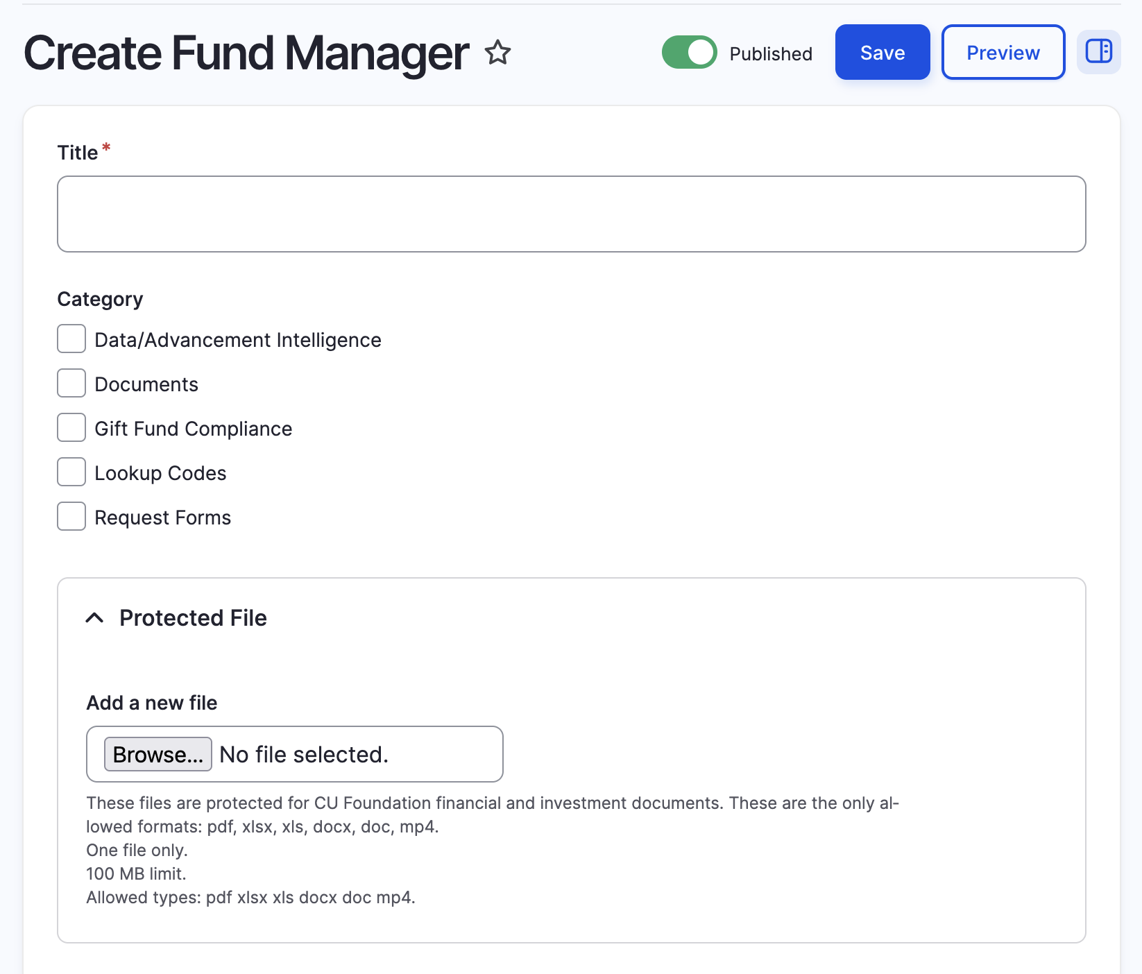
Step 1:
Select "Create" on the left top menu.
Step 2:
Select "Fund Manager" from the dropdown menu.
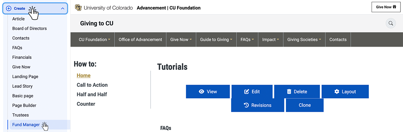
Step 3:
Fill out form as needed.
An Anchor Link (or "Jump Link") is a special type of link that takes a user to a specific spot on the same page, instead of taking them to a different web page. This is used to create smooth, internal navigation, like a table of contents or a "Back to Top" button.
Here is a simple breakdown of Anchor Links:
-
What It Is: An anchor link has two parts:
-
The Anchor Target (ID): A unique marker (a word or phrase) assigned to the specific element (like a section or a block) you want the user to jump to.
-
The Link: A standard link that points to that unique marker (e.g.,
#my-unique-marker).
-
-
What It Does: When a user clicks the link, the page instantly scrolls down (or up) to the content element that has the matching ID.
-
Why It Is Beneficial: It drastically improves user experience on long pages (like this FAQ page!) by allowing users to quickly jump between sections without endless scrolling.
Step-by-Step: Building an Anchor Link Using Layout Builder
The easiest way to create an anchor target on our site is by using the ID field in the Layout Builder Section settings.
-
Create the Anchor Target (The Jump-To Spot):
-
Edit the page using Layout Builder.
-
Click the pencil icon on the Section you want the user to jump to (e.g., the section containing the Site Builder Fundamentals).
-
Select Configure Section.
-
In the configuration modal, look for the ID field.
-
Enter a unique, one-word ID using only lowercase letters and hyphens (e.g.,
site-fundamentals). * Click Save.
-
-
Create the Link:
-
Go to the Menu or Block where you want to place the jump link (e.g., in the main "How-to" menu).
-
Create a new link and set its URL to the hash symbol (
#) followed immediately by your unique ID. -
Example Link URL:
#site-fundamentals -
Save the link. When a user clicks this link, they will jump directly to that section!
-
Alternative Method: Using a Rendered Block's ID
If you cannot edit the section, you can sometimes use the ID automatically assigned to a rendered Block:
-
View the live page.
-
Right-click the block you want to jump to and select Inspect (or "Inspect Element").
-
Look for a wrapping
divor element with a unique ID (it often starts withblock-followed by the block's system name). -
Use that full ID in your link URL (e.g.,
#block-views-latest-news-block).
While Drupal is designed to be "no-code," you may sometimes need to use the "Source" button in the text editor to fix spacing or make text stand out. This section covers the most common tools you need.
Common HTML Tags
HTML is the code that structures the content. You can see these tags by clicking the "Source" button in the text editor toolbar.
-
<br>(Line Break):-
What it is: A tag that forces a text line break.
-
When to use it: Use this when you want text to drop to the next line without creating a new paragraph (which usually adds extra space).
-
Example:
123 Main St.<br>Boulder, CO
-
-
<div>(Division/Container):-
What it is: A generic "container" or "box" used to group content together.
-
When to use it: By itself, it does nothing visible. It is primarily used to wrap content so you can apply a Class to it (e.g.,
<div class="bg-light">Content here</div>).
-
-
<p>(Paragraph):-
What it is: The standard tag for a block of text.
-
When to use it: Most text you type is automatically wrapped in this tag. You can add classes to it to change the font size or weight.
-
Bootstrap Spacing Classes (m and p)
Our site uses Bootstrap, which provides "utility classes" you can add to almost any block or HTML element to instantly change its spacing.
The formula is: {Property}{Side}-{Size}
1. The Property:
-
m= Margin (The space outside the box/border). Use this to push other elements away. -
p= Padding (The space inside the box/border). Use this to give your content breathing room inside its container.
2. The Side:
-
t= Top. -
b= Bottom. -
s= Start (Left). -
e= End (Right). -
x= X-Axis (Left & Right). -
y= Y-Axis (Top & Bottom). -
(blank) = All 4 sides (e.g.,
m-3).
3. The Size (0–5):
-
0= None (Removes spacing). -
1= Tiny. -
2= Small. -
3= Standard. -
4= Large. -
5= Extra Large.
Examples:
-
mt-5: Add Margin to the Top (Size 5). -
pb-0: Set Padding on the Bottom to 0 (Remove space). -
my-3: Add Margin to Top and Bottom (Size 3).
Text Size & Weight Classes
You can make a specific line of text look like a heading without breaking the page structure by adding these classes to a <p> tag.
Text Size (fs-*):
-
fs-1: Biggest (Like an H1). -
fs-2: Big (Like an H2). -
fs-3: Medium (Like an H3). -
lead: Slightly larger and lighter, perfect for intro text. -
small: Smaller text, good for captions or fine print.
Font Weight (fw-*):
-
fw-bold: Makes text Bold. -
fw-normal: Removes bold styling. -
fw-light: Makes text thin/light. -
fst-italic: Makes text Italic.
Snippet Example: <p class="fs-2 fw-bold text-center">Big Bold Centered Text</p>
The Media Library is the central storage space for all images, documents, and videos on the website. Instead of uploading the same image every time you need it, you upload it once to the Media Library, and then you can reuse it everywhere.
Here is a simple breakdown of the Media Library:
-
What It Is: A central, organized place where all digital assets (images, PDFs, videos) are stored and managed.
-
What It Does: It allows you to upload new files and select/reuse existing files when you are building content (e.g., adding an image to a Paragraph, or attaching a PDF to an Article).
-
Why It Is Beneficial (For Content Creators):
-
Asset Reuse: You upload a file once, and you can use it on 10 different pages. If you update the file in the Media Library, it automatically updates on all 10 pages.
-
Organization: Everything is searchable and organized, making it easy to find that specific document or photo you need.
-
Consistency: The system automatically ensures images are resized and formatted correctly for the site's design.
-
Step-by-Step: Adding and Using Media
You interact with the Media Library every time you click the "Add Media" button while editing content.
-
Start the Process: While editing a Content Type or Paragraph, click the "Add Media" button next to an Image, Document, or File field. A pop-up window for the Media Library will appear.
-
To Upload a New File:
-
Click the "Add file" button (or "Add image").
-
Select the file(s) from your computer.
-
Crucial Step: Provide a Name and clear Alternative Text (Alt Text) for every image. The Alt Text describes the image for visually impaired users and search engines.
-
Click Save.
-
-
To Reuse an Existing File:
-
In the Media Library pop-up, use the Search box to find the file you previously uploaded.
-
Check the box next to the image or document you want to use.
-
Click the "Insert Selected" button.
-
-
Complete the Process: The file will now appear in your content field. Finish editing the page and Save the content node.
Official Drupal Documentation Links
-
Media Library Overview (Drupal User Guide):
Bootstrap Grid Classes (Column Width & Centering)
The Bootstrap Grid System is what controls the layout of the page. It divides the screen into 12 conceptual columns. You can set an element to span a certain number of those columns, and you can change the size based on the screen width (responsive design).
The formula is: col- {breakpoint} - {width}
1. The Breakpoint (Screen Size)
This lets you tell the page how wide an element should be based on the size of the user's screen (mobile, tablet, or desktop).
col-sm-: Applies to Small screens and up (e.g., phones in landscape).col-md-: Applies to Medium screens and up (e.g., tablets/laptops).col-lg-: Applies to Large screens and up (e.g., desktops).col-: Applies to ALL screen sizes (usually only used to span the full width).
2. The Width (1–12)
This specifies how many of the 12 columns the element should span.
-12: Full Width (12/12). Always use this on small screens to ensure content fits.-7: 7/12 Width. Use this for main content, leaving room for a sidebar.-6: Half Width (6/12). Use this to place two equal-sized elements side-by-side.-4: One-Third Width (4/12). Use this to display three equal-sized elements.
3. How to Center a Column
To automatically center a column or container that is less than 12 columns wide, use the mx-auto class.
mx-auto: Margin X-Axis Auto. Add this to a column to automatically center it within the row.
Snippet Example:
<div class="row">(The row container)<div class="col-sm-12 col-md-7 mx-auto">(The column)<p>This content will span the full width on phones, but will narrow to 7 columns and be centered on desktop.</p></div></div>
Official Boostarp Documentation
-
Bootstrap Columns:
Site Builder Fundamentals
This section is dedicated to site administrators and content managers. It provides fundamental definitions and 'how-to' guides for managing the structure, layout, and user accounts within our Drupal 10 website.
If Regions are the containers that make up your site's layout, then Blocks are the pieces of content you put inside those containers. A Block is the fundamental unit of content or feature management in Drupal's layout system.
Here is a simple breakdown of Blocks:
-
What They Are: A Block is a single, defined piece of content or interactive feature that is separate from the main page content. Examples include the site logo, a navigation menu, the search box, a social media feed, or a block of custom text (like a phone number).
-
What They Do (Their Function):
-
Deliver Content: Blocks are responsible for delivering everything on your page that isn't the primary article or node content.
-
Display Features: They manage functional elements, such as user login forms, "Recently Viewed" lists, or language switchers.
-
Controlled Placement: Blocks are placed into Regions to determine exactly where they appear on the page (e.g., placing the Main Menu Block in the Header Region).
-
-
Why They Are Beneficial (For You):
-
Total Content Reusability: Once you create a Block (e.g., a "Contact Us" phone number), you can instantly place it into any Region on any page of the site without having to recreate the content.
-
Granular Visibility Control: Blocks give you fine-tuned control over who sees them and where. You can easily configure a Block to only appear on the homepage, or only to users who are logged in, or only on pages belonging to a specific content type.
-
Layout Flexibility: By combining Blocks and Regions, you gain immense power to customize the layout of your pages, ensuring that the right feature is presented to the right user in the right spot, without ever writing custom code.
-
Official Drupal Documentation Links
-
Concept: Blocks (Drupal User Guide): This provides the best high-level explanation.
-
Managing Blocks (Drupal User Guide): This explains the practical steps of placing and configuring Blocks.
A Region is a foundational concept in Drupal's layout system. Think of a Region as a designated container or structural box on your website's page that is defined by your chosen theme (design template).
Here is a simple breakdown of Regions:
-
What They Are: Regions are named areas (like "Header," "Sidebar," "Content," or "Footer") that carve up your website's visible space. They are the structure that holds the actual site elements.
-
What They Do (Their Function):
-
They hold Blocks: The sole purpose of a Region is to be a space where you can place Blocks (the actual pieces of content, such as your logo, the main menu, a search box, or a custom text feature).
-
They Define Layout: The combination of active Regions on a page determines the overall layout and design (e.g., a theme with "Sidebar First" and "Sidebar Second" regions allows for a three-column layout).
-
-
Why They Are Beneficial (For You):
-
Easy Customization: Regions allow you to change the location of your site's features (Blocks) simply by using the administrative interface—you can move the search bar from the "Header" region to the "Sidebar" region with drag-and-drop, without touching any code.
-
Site Consistency: Any Block placed in a specific Region (like the main menu in the "Header") will appear in that exact, consistent location across all pages of the site, creating a professional and unified user experience.
-
Simplified Redesign: Because Regions separate the content from the design, if you ever change your theme, your content (Blocks) is preserved and automatically re-mapped, making major redesigns much less work.
-
Official Drupal Documentation Links
Concept: Regions in a Theme (Drupal User Guide).
https://www.drupal.org/docs/user_guide/en/block-regions.html
Placing a Block in a Region (Drupal User Guide):
f Drupal were a filing cabinet, a Content Type would be the labeled folder or template you use to keep similar kinds of information organized. It defines the structure and rules for a specific type of content on your site.
Here is a simple breakdown of Content Types:
-
What They Are: A Content Type is a template or blueprint that pre-defines what kind of information (fields) will be stored for a specific item. Common examples are "Article" (for news and blog posts) and "Basic Page" (for static pages like "About Us" or "Contact").
-
What They Do (Their Function):
-
Define Fields: They determine the required fields for that content. For example, the "Article" Content Type typically has fields for Title, Body (main text), Image, and Tags. A "Product" Content Type might have fields for Price, Weight, and SKU.
-
Control Display: Content Types control how the content is presented to the user. You can set the image to display above the body text for Articles, but below the price for Products.
-
Set Permissions: They allow you to set specific rules about who can create, edit, or delete that particular kind of content.
-
-
Why They Are Beneficial (For You):
-
Guaranteed Consistency: Content Types ensure that every piece of content created under that template (e.g., every blog post) has the exact same structure and required information. This is critical for professional consistency and data integrity.
-
Flexibility & Customization: You are not limited to the defaults! You can create completely custom Content Types (like "Employee Profile," "Recipe," or "Case Study") and add unique Fields to perfectly match the data you need to store.
-
Powerful Organization: By grouping similar content together, Content Types allow other Drupal systems (Views and Taxonomy) to easily filter, display, and organize your site's information in dynamic ways.
-
Official Drupal Documentation Links
-
Concept: Content Types (Drupal User Guide): This is the best place to start for the high-level concept.
-
Adding a Field to a Content Type (Drupal User Guide): This explains the practical application of fields.
Views is Drupal's most powerful tool for creating and displaying organized lists of content. It is often described as a visual query builder, because it lets you talk to your website's database and ask, "Show me this information, in this format, and sorted this way." You can do this entirely through a graphical user interface—no coding required!
Here is a simple breakdown of the Views System:
-
What It Is: Views is a core administrative module that provides a user-friendly interface for designing dynamic content displays. Instead of writing complex database code (SQL), you simply choose options from drop-down menus and checkboxes.
-
What It Does (Its Function):
-
Pulls Data: It fetches data from your site's database, including Content Types (Articles, Products, etc.), Users, Taxonomy Terms, and more.
-
Formats Displays: It presents this data in various formats, such as:
-
A full Page (e.g., a "News" listing at
/news). -
A small Block (e.g., a "Recent Articles" list in the sidebar).
-
A Table, Grid, List, or Slideshow.
-
-
Filters and Sorts: It allows you to specify exactly which items to show (e.g., only published articles tagged "Events") and how to order them (e.g., newest first, or alphabetically by title).
-
-
Why It Is Beneficial (For You):
-
Dynamic Content Creation: Views allows you to create complex pages that update automatically. For example, you create a "Upcoming Events" view once, and as you add new event content and its date passes, the list updates itself correctly.
-
Zero Coding Required: You can build sophisticated data presentations—from a custom administrative table to an image gallery—without ever needing to write SQL or PHP code.
-
User Interaction: You can add Exposed Filters to your view, allowing site visitors to filter and sort the results themselves (e.g., letting a user filter a product list by "price range" or "category"). This vastly improves the user experience.
-
Official Drupal Documentation Links
-
Concept: Uses of Views (Drupal User Guide): This provides an excellent overview of what you can accomplish with Views.
-
Creating a Content List View (Drupal User Guide): A step-by-step guide to building a basic view.
Taxonomy is Drupal's formal system for classifying, grouping, and tagging your content. Think of it as creating a structured library catalog for your website, allowing you to easily label, categorize, and find related pieces of information.
Here is a simple breakdown of the Taxonomy System:
-
What They Are: Taxonomy is made up of two key components:
-
Vocabularies: These are the containers or lists for your classification terms (e.g., a Vocabulary named "News Topics," "Product Categories," or "Locations").
-
Terms: These are the actual tags or labels within a Vocabulary (e.g., in the "News Topics" Vocabulary, the Terms could be "Sports," "Politics," and "Weather").
-
-
What They Do (Their Function):
-
Classify Content: Taxonomy Terms are attached to Content Types (like Articles or Products) using Fields. This tags the content with relevant labels (e.g., an Article is tagged with "Sports").
-
Create Relationships: They establish connections between different pieces of content that share the same tags, even if the content is from different Content Types.
-
Enable Navigation: They automatically generate pages that list all content sharing that same Term. For example, clicking the "Sports" tag takes the user to a page listing all articles tagged "Sports."
-
-
Why They Are Beneficial (For You):
-
Better Organization: Taxonomy allows you to categorize content far beyond simple Content Types, ensuring every piece of information is clearly labeled and easy to locate for both users and administrators.
-
Powerful Filtering (with Views): Taxonomy is the most common way to filter content when using Views. You can easily create dynamic lists that only show, for example, "Products in the 'Electronics' Category" or "Employees in the 'Marketing' Department."
-
Improved SEO: Using consistent tags and categories helps search engines understand the context and relationships between your content, which can improve your site's visibility and search rankings.
-
Official Drupal Documentation Links
-
Concept: Taxonomy (Drupal User Guide): This provides the best high-level explanation of the system.
-
Adding Terms to a Vocabulary (Drupal User Guide): This explains the practical steps of creating your classification structure.
How do I build a redirect?
A redirect automatically sends visitors from one URL to another. Use them when a page has moved, been deleted, or to create a short "vanity" URL for marketing.
Why redirects matter
- Prevent broken links: Old links point to new content instead of a 404 error.
- Preserve SEO: Passes ranking value to the new page via "301 Permanent" status.
- Vanity URLs: Use clean paths like
giving.cu.edu/my-fundfor print and social media.
Access the Tool
Configuration → Search and metadata → URL Redirects → Add Redirect
Check for Conflicts
Search the URL Redirects list to ensure your intended path isn't already taken. Duplicate paths will cause a save error.
Fill in "From" (The Source)
Enter the slug only—no domain, no leading slash.
my-fund-name
Rules: Lowercase, numbers, and hyphens only. No spaces.
Fill in "To" (The Destination)
Internal: Use the internal path (e.g., /about-us or node/123).
External: Use the full URL (e.g., https://giving.cu.edu/other-page).
Pro Tip: Avoid redirect chains. Point your vanity URL directly to the final destination URL.
Confirm Status Code
Leave set to 301 Permanent for almost all situations. Use 302 Temporary only if the destination will change frequently (e.g., a monthly rotating campaign).
Save and Test (Incognito)
Click Save. Test the new link in an Incognito/Private browser window. This ensures you aren't seeing a cached version of a previous 404 error.
Official Documentation
The User, Role, and Permission system controls who can do what on your Drupal site. A user is anyone who visits your site, and this system ensures everyone has the exact level of access they need—no more, no less.
Here is a simple breakdown of Users, Roles, and Permissions:
-
What are Permissions?
-
A Permission is a single, specific action a user is allowed to perform, such as "create article content," "edit any basic page," or "administer site configuration." Permissions are defined by Drupal core and any installed modules.
-
-
What are Roles?
-
A Role is a label or job title that bundles together a collection of these Permissions. Instead of assigning 50 individual permissions to every user, you assign them a single Role (e.g., "Editor").
-
Users can have multiple roles, and their permissions are cumulative.
-
-
What are the Default Roles?
-
Anonymous user: Anyone visiting the site who is not logged in. This role has minimal permissions (usually just viewing published content).
-
Authenticated user: Any user who is registered and logged in. All logged-in users automatically get this role, plus any custom roles assigned.
-
Administrator: A role with full access to almost all website functions, site configuration, and user management. This role should only be assigned to a few trusted individuals.
-
How to Add a New User and Assign Permissions
The process involves two main steps: creating the user account and assigning the appropriate role.
-
Create the User Account:
-
Log in as an Administrator.
-
Go to People in the administration menu (path:
/admin/people). -
Click the + Add user button.
-
Fill in the Username, Email address, and Password (or check the box to let the user set their own).
-
In the Roles section, check the box next to the appropriate role(s) you wish to assign (e.g., Authenticated user and Content Editor).
-
Click Create new account to save.
-
-
Assign Permissions to a Role (If needed):
-
Go to People > Permissions (path:
/admin/people/permissions). -
This page shows a grid where Permissions are listed down the side (grouped by module) and Roles are listed across the top.
-
To grant an action (permission), find it in the list and check the box that corresponds to the desired Role.
-
Best Practice: Follow the Principle of Least Privilege (PoLP)—only give users the minimum permissions they need to perform their job tasks, nothing more.
-
Official Drupal Documentation Links
-
Concept: Users, Roles, and Permissions: The fundamental guide to how the system works.
-
Creating a User Account (How-To):
-
Assigning Permissions to a Role:
This video provides a helpful overview of the different roles and how the permission system works in Drupal:
A Field is the specific data input area attached to a Content Type (or other entity) that stores one single piece of information. If a Content Type is the template for a Blog Post, the Fields are the individual boxes the user fills out to create the post.
Here is a simple breakdown of Fields:
-
What They Are: Fields are like columns in a spreadsheet or separate boxes on a form. They define what kind of data can be entered and how it behaves. Examples include:
-
Text (plain): For short phrases like a sub-heading or person's name.
-
Long Text: For main body content or descriptions.
-
Image: For uploading a single image file.
-
Integer/Decimal: For numbers, like a price or a count.
-
Term Reference: For selecting a Taxonomy tag.
-
-
What They Do (Their Function):
-
Data Structure: They enforce a specific, consistent structure for every piece of content. Every "Article" on your site will always have a separate field for the "Image" and "Body".
-
Input Control: Fields use Widgets (like a simple text box, a file upload button, or a drop-down list) to control how the user enters the data.
-
Display Control: Fields use Formatters to control how the data looks to the site visitor (e.g., showing a full image, or just a small thumbnail version of the image).
-
-
Why They Are Beneficial (For You):
-
Precise Content Modeling: You can create custom fields for very specific needs (like a "Product SKU" field or an "Event Date" field) that your Content Type needs, ensuring you only collect the exact data required.
-
Views Integration: Views uses these individual fields to sort, filter, and display data. For example, you can create a list that only shows the Title Field and the Image Field from all the Article Content Types.
-
Content Reusability: Because data is stored in separate, defined fields, you can easily display the same content in different ways across your site without duplicating the data.
-
Official Drupal Documentation Links
-
Concept: Content Entities and Fields: The high-level concept of how fields relate to your content structure.
-
Working with content types and fields (Drupal Wiki): Explains fields, field types, and field instances.
This video provides an overview of documentation for site builders, including information about fields and content types.
In Drupal, a Menu is simply a structured collection of links used for navigation. Menus are the most critical tool for helping your site visitors find content, and they are managed completely through the administrative interface.
Here is a simple breakdown of the Menu System:
-
What They Are: A Menu is a custom-made list of navigation links that you create. Common examples include:
-
Main navigation: The primary links across the top of the site.
-
Footer: A simple list of compliance or contact links at the bottom.
-
User account menu: Links like "My account" or "Log out."
-
-
What They Do (Their Function):
-
Organize Navigation: They allow you to create a logical, hierarchical structure (parent and child links) for your site's content, which is key for good user experience.
-
Provide Links: Each menu item can link to an internal page (like a Content Type page you created) or an external URL (like a link to a partner site).
-
Display via Blocks: Once a Menu is created, it is presented on the site using a Menu Block. This Menu Block is then placed into a Region (like the "Header" Region) to make it visible.
-
-
Why They Are Beneficial (For You):
-
Drag-and-Drop Control: You can easily add, edit, rename, and reorder your navigation links (including sub-menus) using a simple drag-and-drop interface, without touching any code.
-
Multiple Uses: The same menu can be displayed in multiple places. You can use one Menu Block to show the full navigation in the Header and another Menu Block to show a condensed version in the Sidebar.
-
Accessibility and SEO: A clear, well-structured menu helps site visitors and search engines understand the importance and relationship of your pages, which is beneficial for both accessibility and search engine optimization.
-
Official Drupal Documentation Links
-
Concept: Menu System (Drupal User Guide): This provides the best high-level explanation of the system.
-
Managing Menus (Drupal User Guide): This covers the practical steps of adding links and rearranging the order.
Caching is a crucial performance feature that saves a temporary copy of your website's data and pages so they can load quickly. Since our site's content does not change daily, the cache is set to update automatically every 24 hours.
However, when you make a structural or urgent content change, you need to manually "clear" or rebuild the cache to force the changes to appear instantly.
Here is a simple breakdown of Clearing Caches:
-
What is Caching? It's a performance feature that stores temporary copies of your website's structure and content to improve page load speed.
-
What is Clearing Caches? It means deleting all those temporary copies and forcing Drupal to instantly rebuild the entire site from scratch, using the very latest configuration settings and content.
Why Does Clearing Caches Matter?
-
Overrides the 24-Hour Delay: If you publish a new page or move a Block, the changes won't be visible to the public until the next cache update (up to 24 hours later). Rebuilding the cache makes the changes live right now.
-
Fixes Display Issues: It is the standard, first-step solution for troubleshooting any unexpected visual bugs or errors after making configuration changes.
-
Ensures Latest Configuration: It makes sure your site is using the latest version of the theme, modules, and any structural settings.
When Should I Clear Caches?
You should manually clear the cache any time you make a change that doesn't immediately show up correctly on the live site:
-
After changing the site's structure (moving a Block, adding a Field, or modifying a Region).
-
After updating a module or the main Drupal theme.
-
After making complex changes to a View or Content Type.
-
Any time content is not displaying correctly.
Step-by-Step: How to Clear Caches
You manage this using the "Rebuild Cache" button in the administrative toolbar.
-
Locate the Button: The button is visible in the top administrative bar on most pages. (Refer to the screenshot provided).
-
Click to Execute: Click the "Rebuild Cache" button.
-
Wait for Confirmation: The site will reload, and you will see a small confirmation message once the cache has been successfully rebuilt. The process is usually quick.
Official Drupal Documentation Links
-
Concept: Caching: Explains why caching is used and the general process.
Custom Content Components (Tutorials)
These guided tutorials walk you through the creation and configuration of the custom content components available on our site. These components—such as the Call to Action, Counter, and Half and Half—are advanced Blocks and Paragraphs that utilize specific fields and settings to give your pages a powerful, branded look without needing any custom code.


Half and Half Tutorial
This will walk through the steps needed to create a Half and Half block.
Half and Half Tutorial
This will walk through the steps needed to create a Half and Half block.